A restaurant concept developed from the ground up, including:
Visual identity, branding, content, and a printed menu
Responsive multi-page website
Hand-coded HTML, CSS, JavaScript and jQuery
Custom layouts, interactive elements and embedded maps
My current web workflow uses modern platforms and development tools, but building this from scratch created a strong foundation in front-end development and in translating design into code.
Working beyond the limitations of templates and page builders, editing existing code can streamline the process when a project needs something more customized.
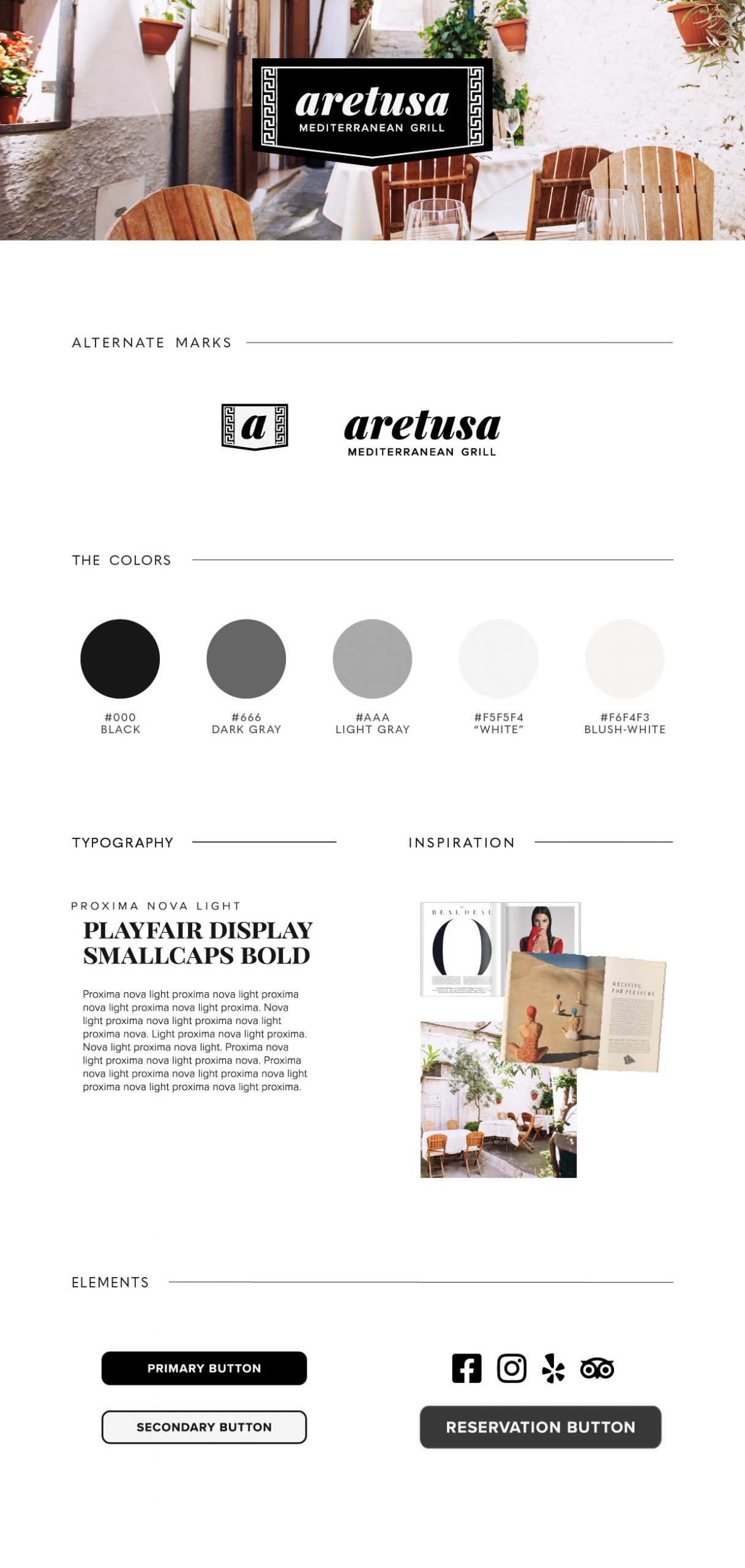
The neutral color scheme was chosen to let the vibrant colors in the photos stand out. Type decisions were somewhat limited due to the need for multiple language subsets.
The key-style border was created to be used on its own as another branding element.
Website Layout
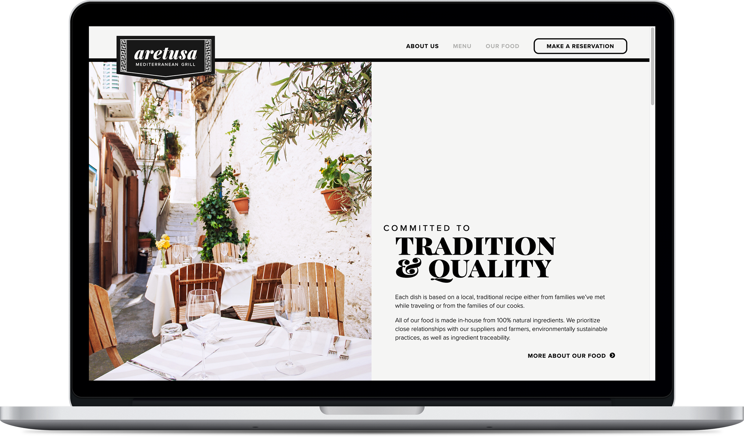
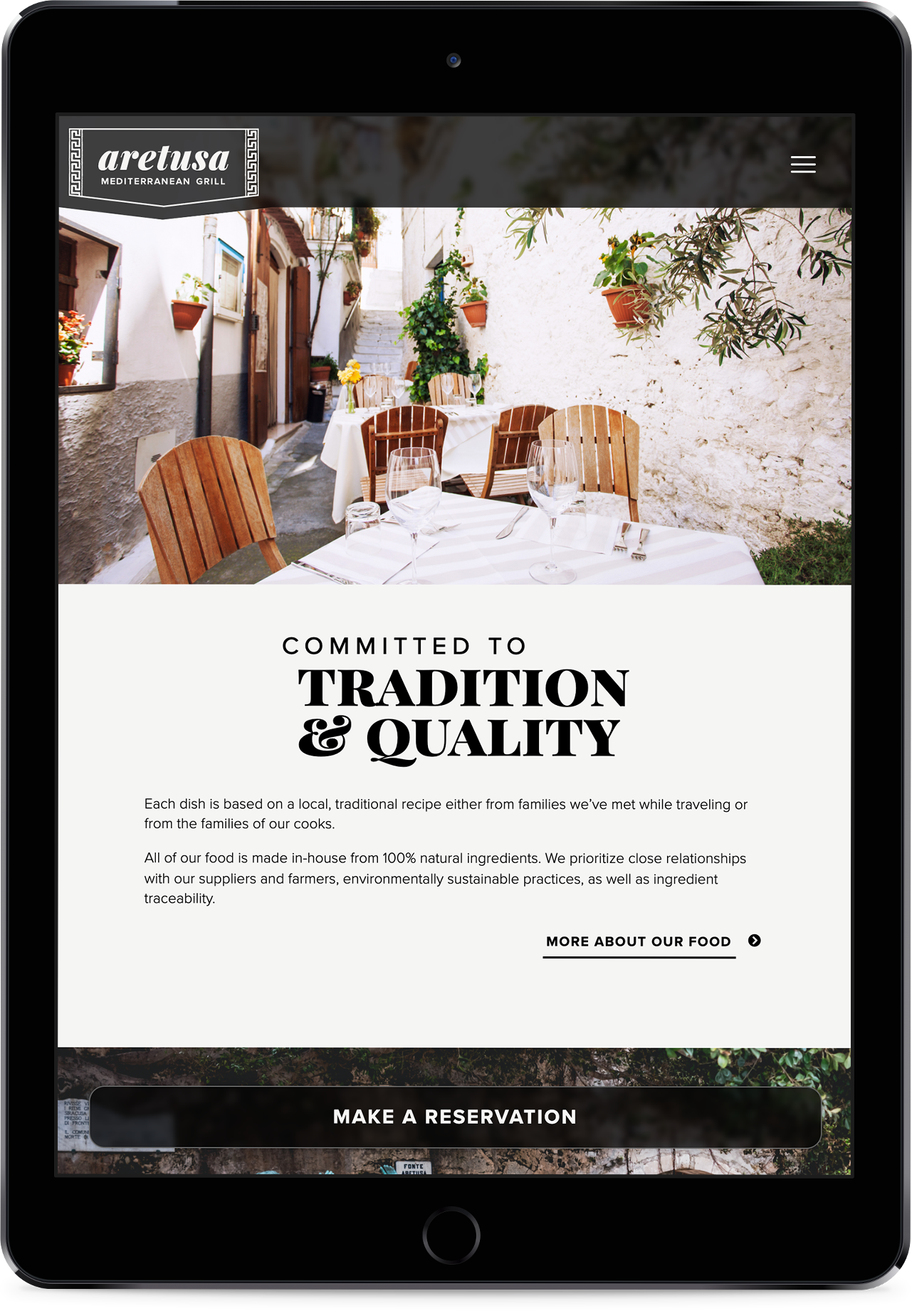
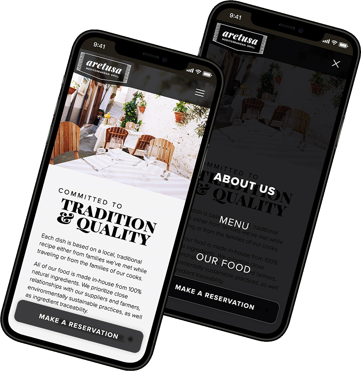
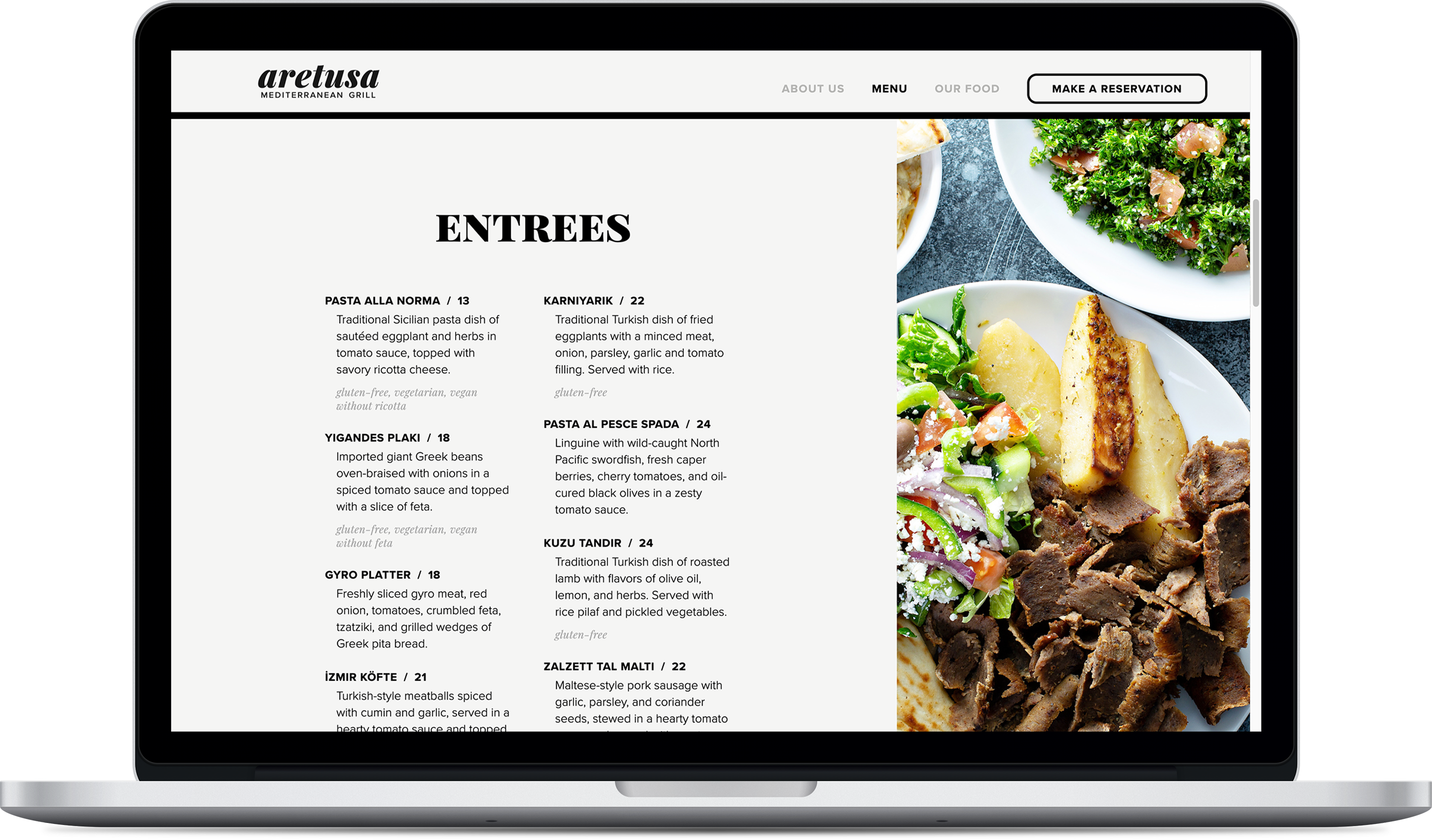
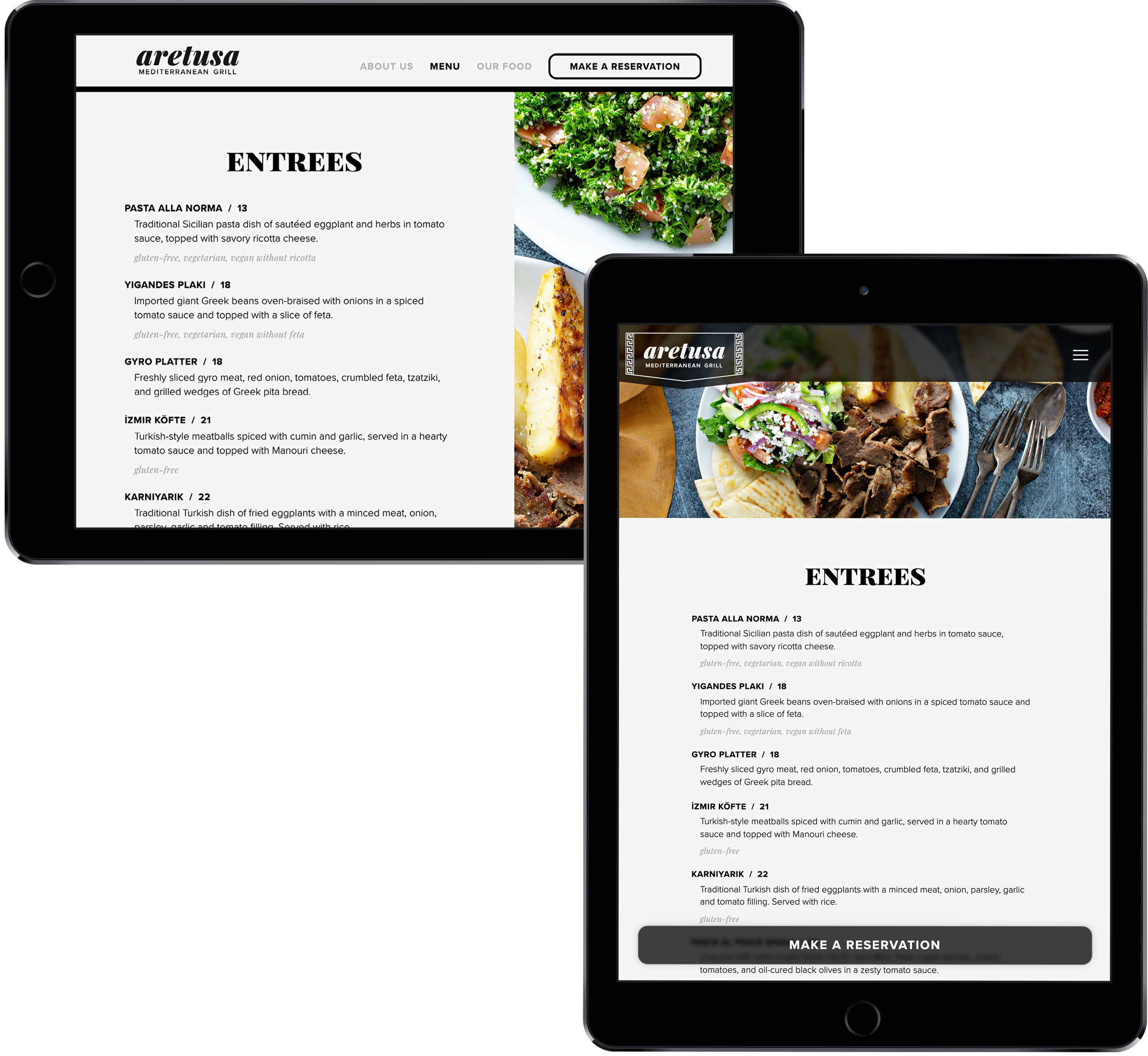
Each device’s layout allowed plenty of space for the photos to stand out. The desktop layout was inspired by a magazine spread, and the two columns became one for tablet and mobile formats.
Website Layout
Each device’s layout allowed plenty of space for the photography to stand out. The desktop layout was inspired by a magazine spread, and the two columns became one for tablet and mobile formats.
Logo Change
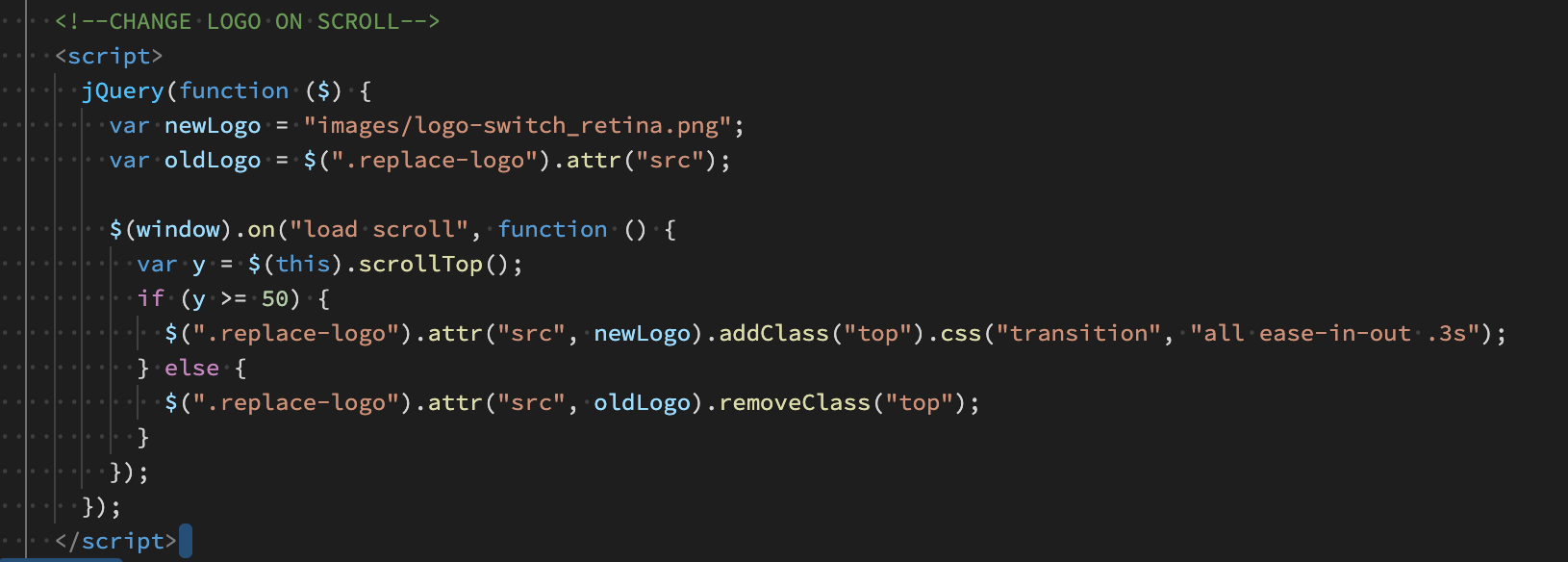
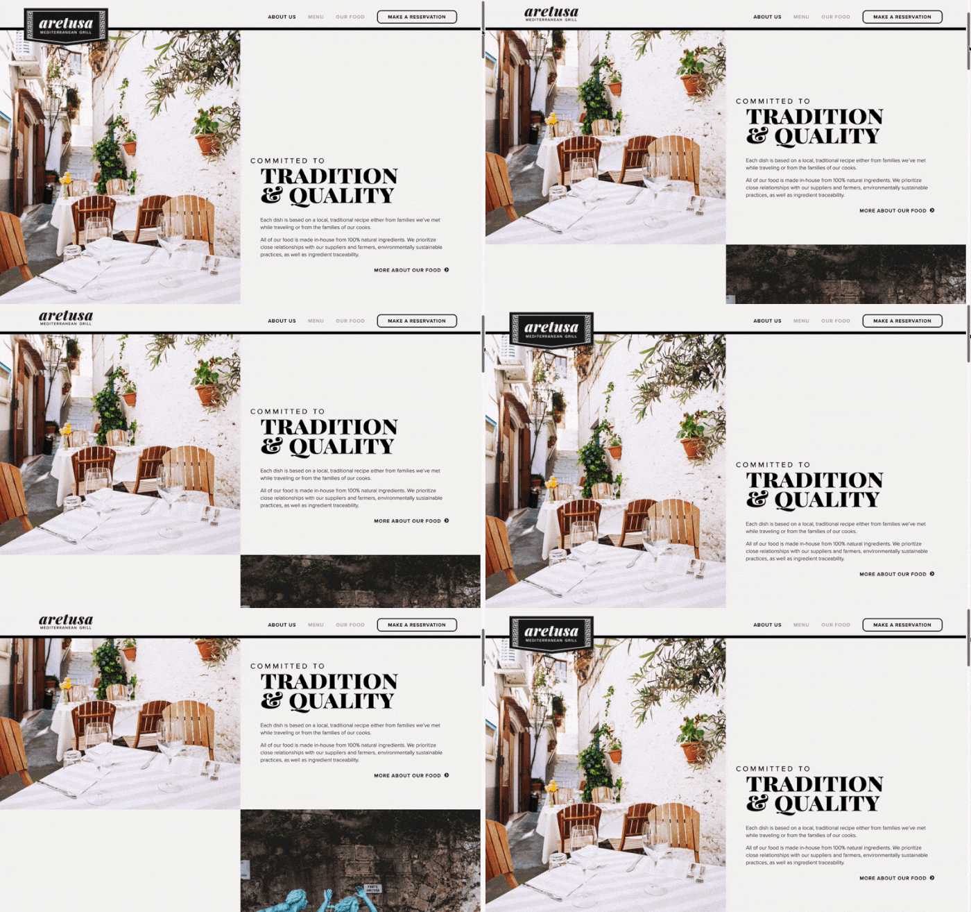
jQuery was used to make the logo switch to its more compact variant when the user scrolled down the page.
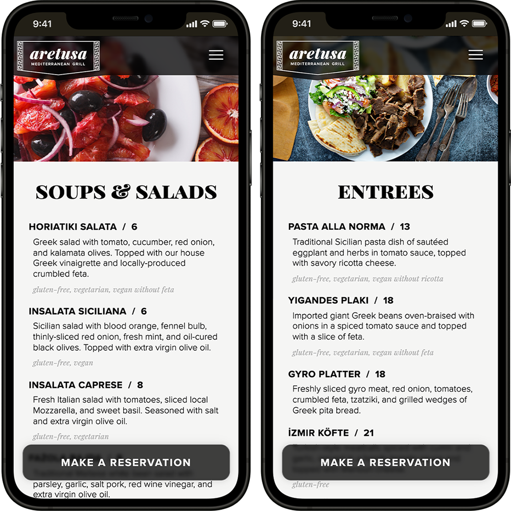
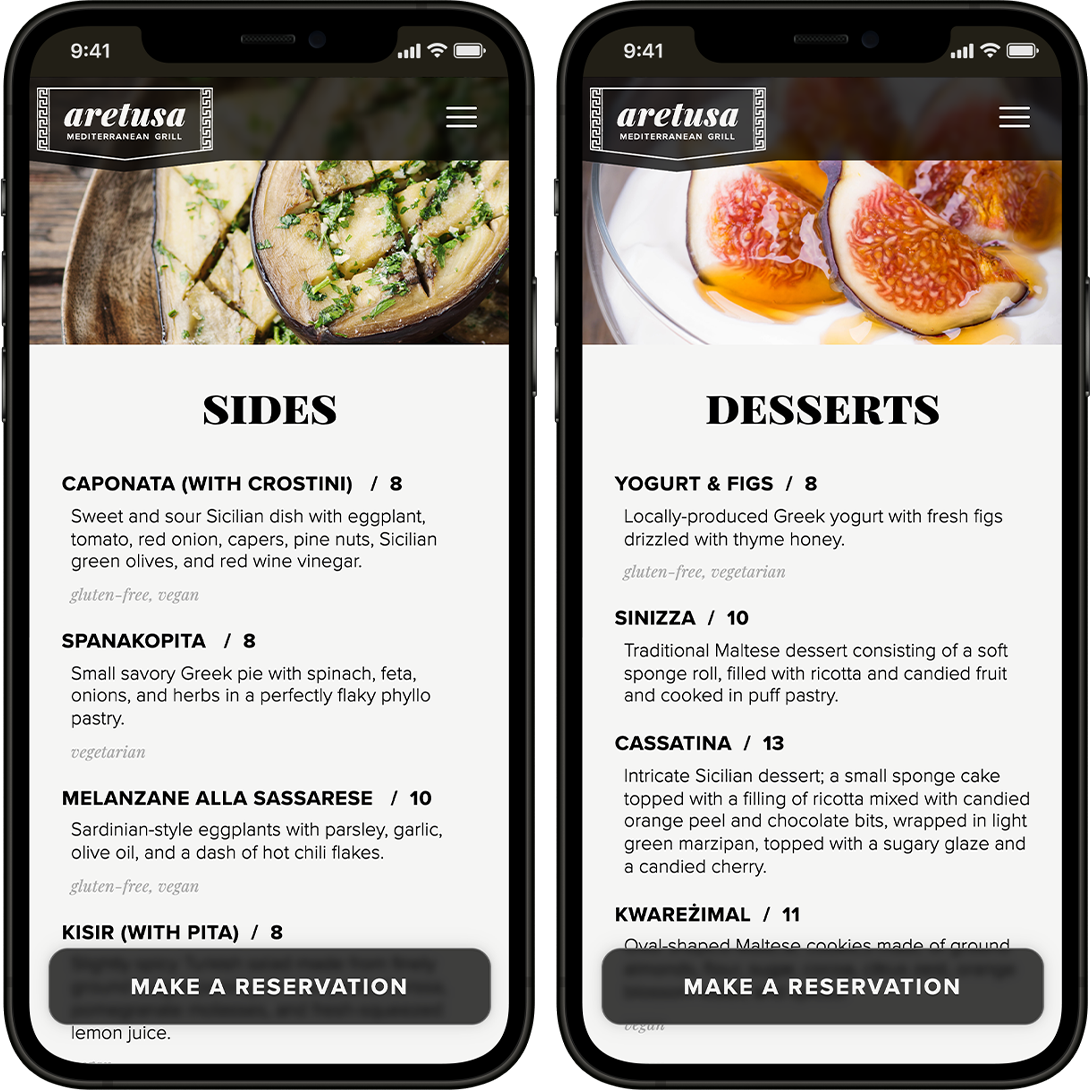
The Menu
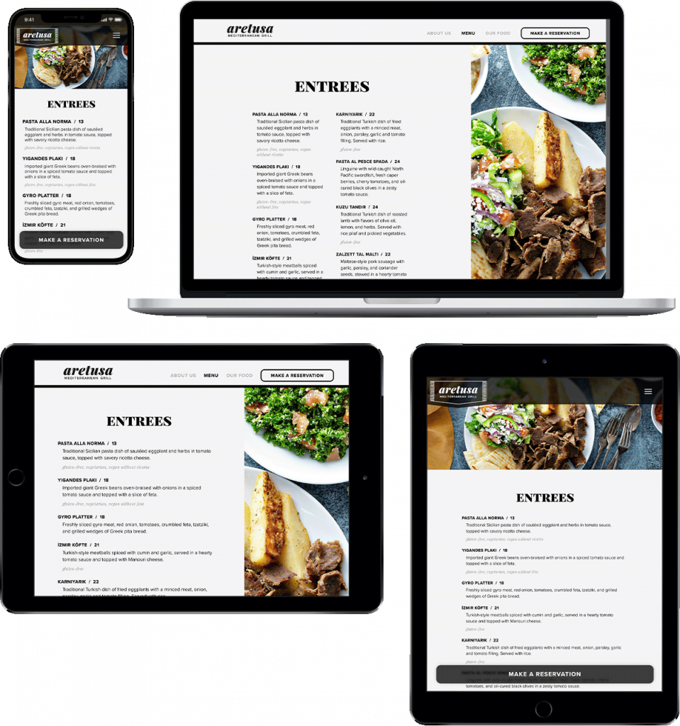
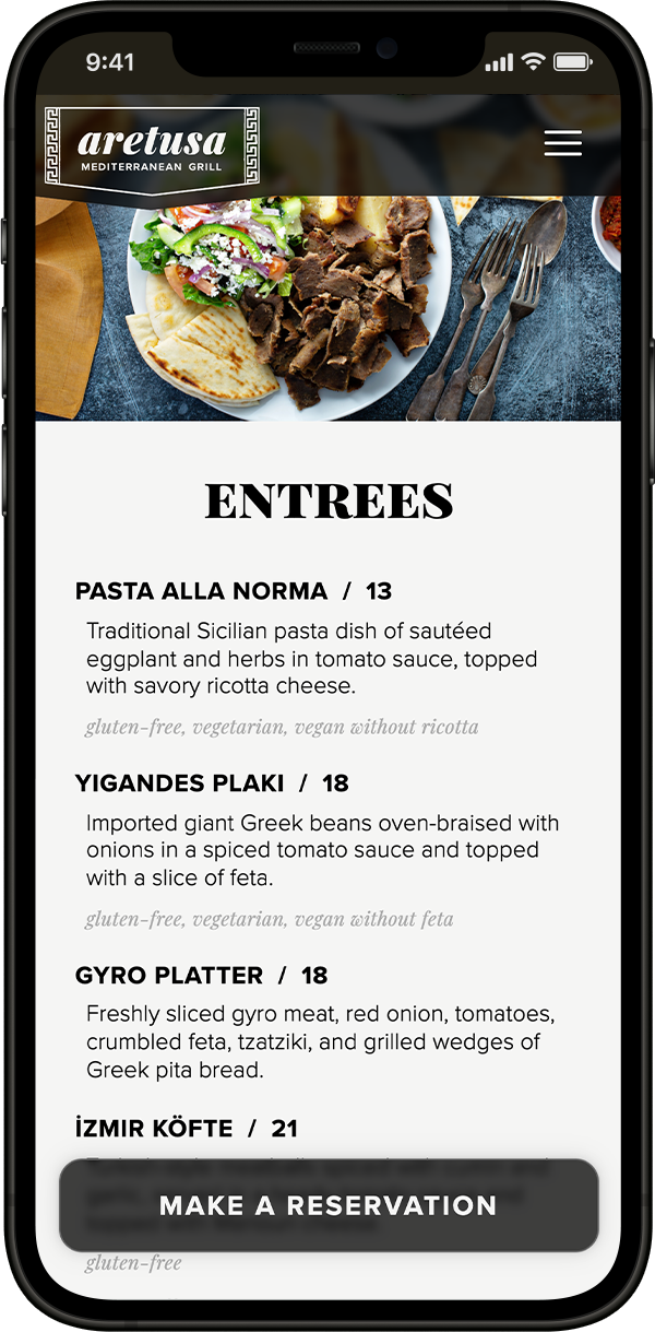
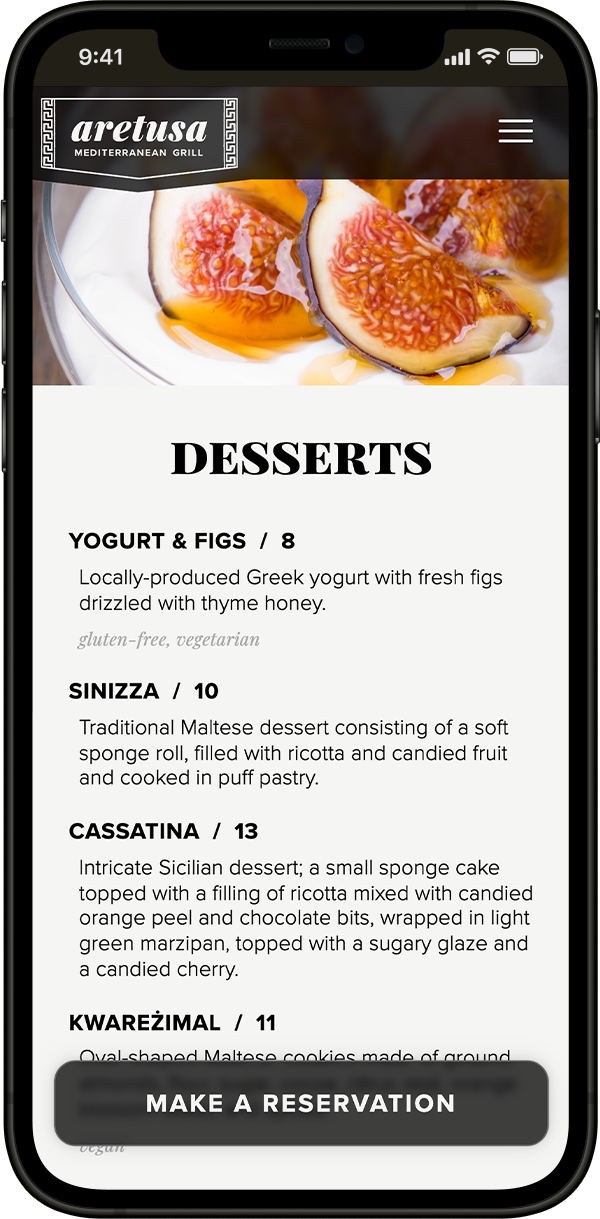
A responsive menu with a clear hierarchy was a primary need. The two-column layouts (entrees and desserts) switch to single column for landscape-oriented tablets. Everything becomes one column for portrait-oriented tablets and mobile devices.
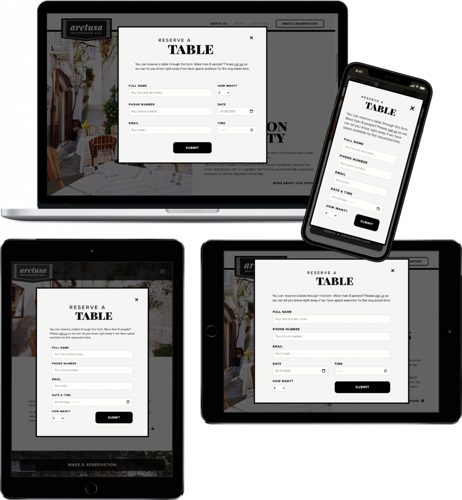
Reservations Modal
To prioritize reservations, the pop-up modal can be accessed from anywhere on the site. The button in the header on the desktop layout becomes a fixed button at the bottom of the window for smaller screens.
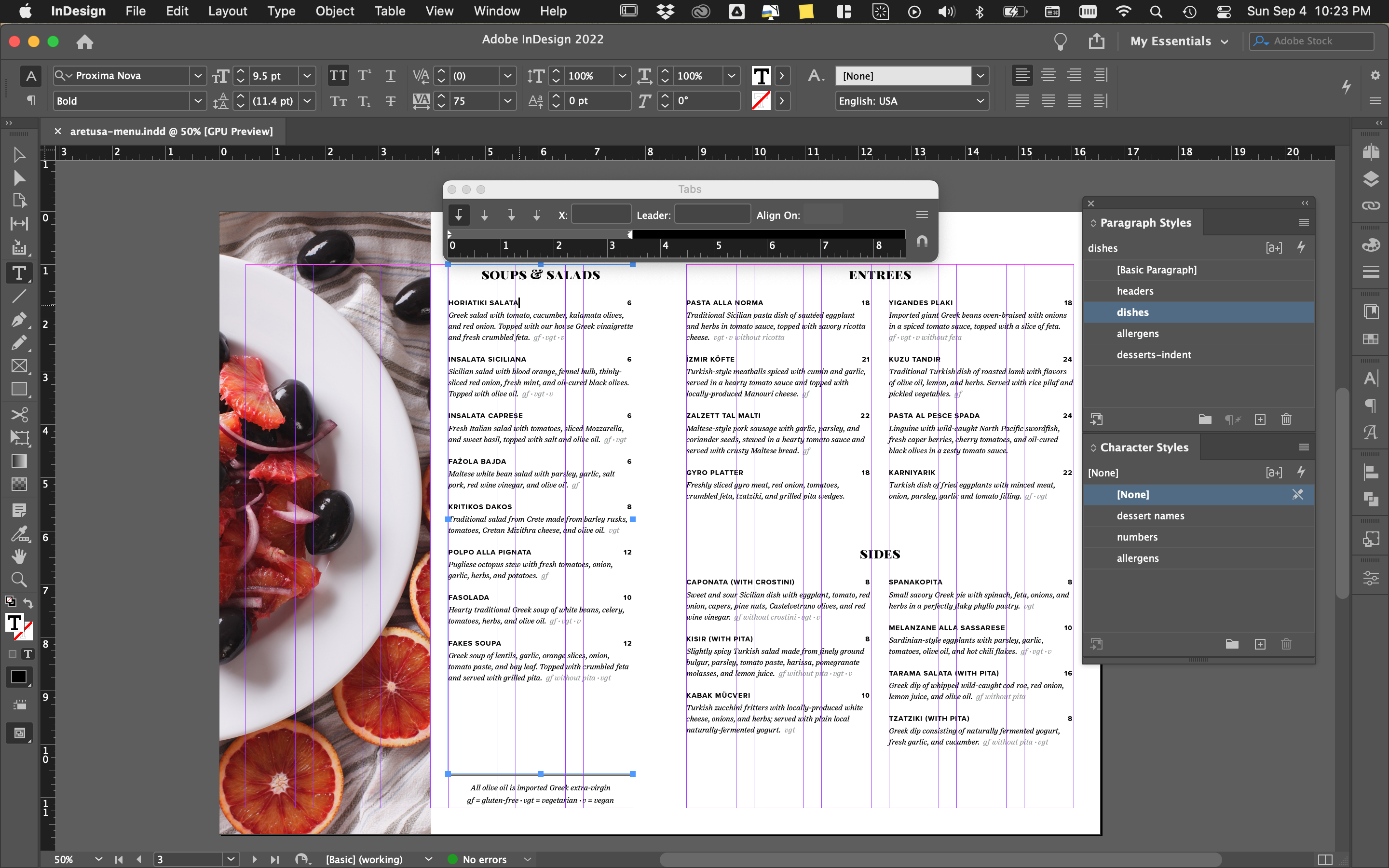
Printed Menu
Finally, I included a printed menu in the style of the website; see screenshot below for the InDesign file setup.