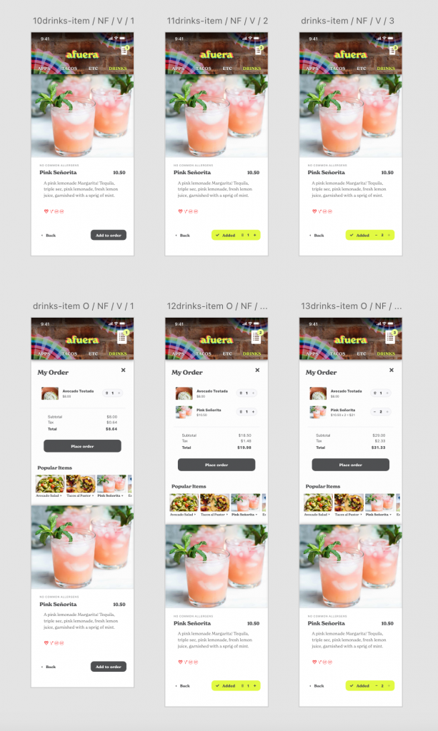
Below is the tested sequence. I took notes on the experience and made adjustments to the final product.
Instructions:
Navigate to the “etc” page
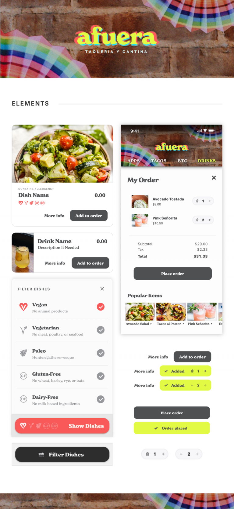
Filter dishes by Vegan
Check the description page: Does the Vegan Avocado Tostada contain almonds? If not, add one to your order
Check the order to see the final price of the tostada with tax
From the “My Order” section, find out what’s in the Pink Señorita drink
Add one drink to your order
Check final price, add one more Pink Señorita (2 total) from the “My Order” section
Place your order
Instructions:
Navigate to the “etc” page
Filter dishes by Vegan
Check the description page: Does the Vegan Avocado Tostada contain almonds? If not, add one to your order
Check the order to see the final price of the tostada with tax
From the “My Order” section, find out what’s in the Pink Señorita drink
Add one drink to your order
Check final price, add one more Pink Señorita (2 total) from the “My Order” section
Place your order
Visual Identity
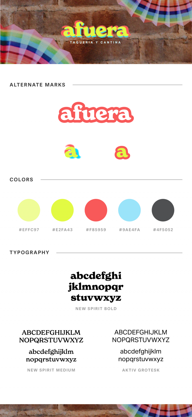
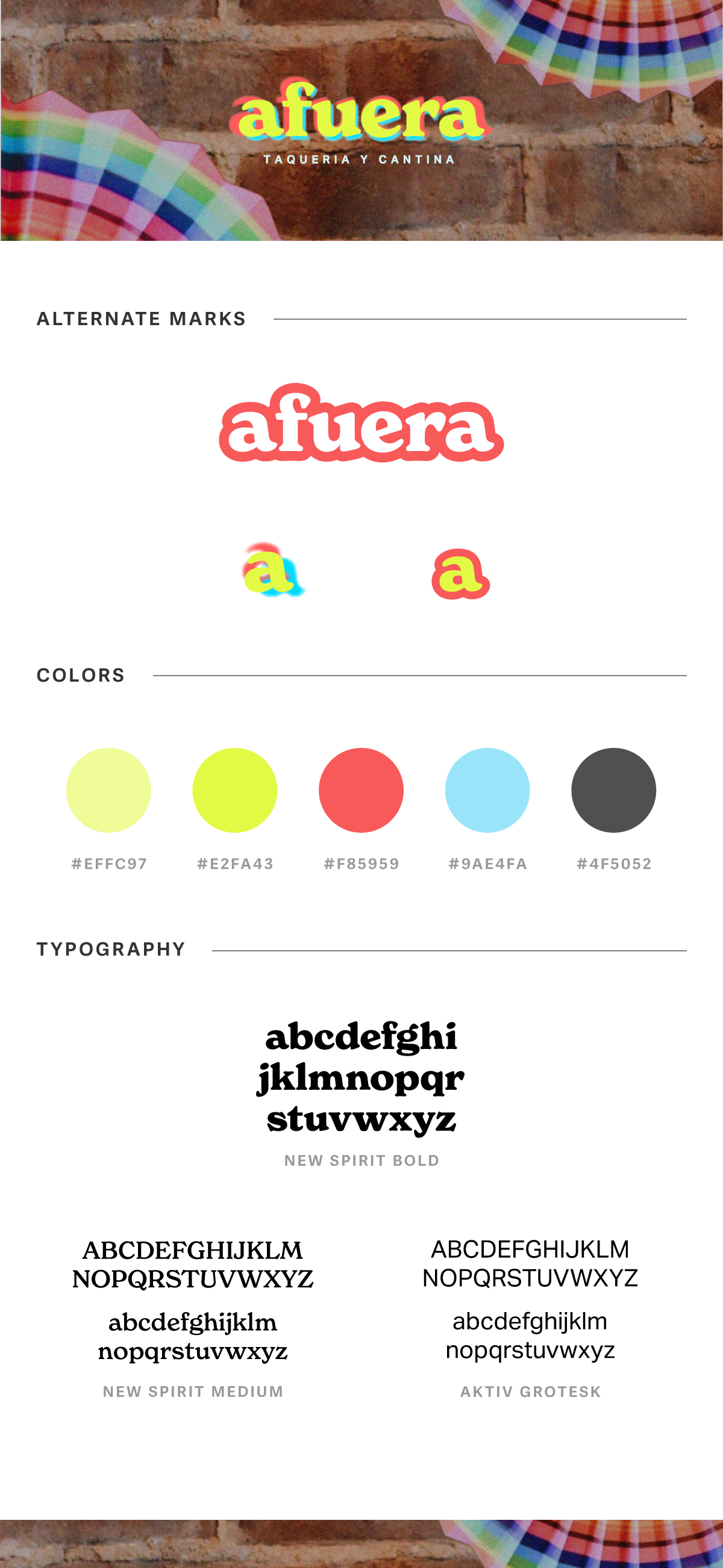
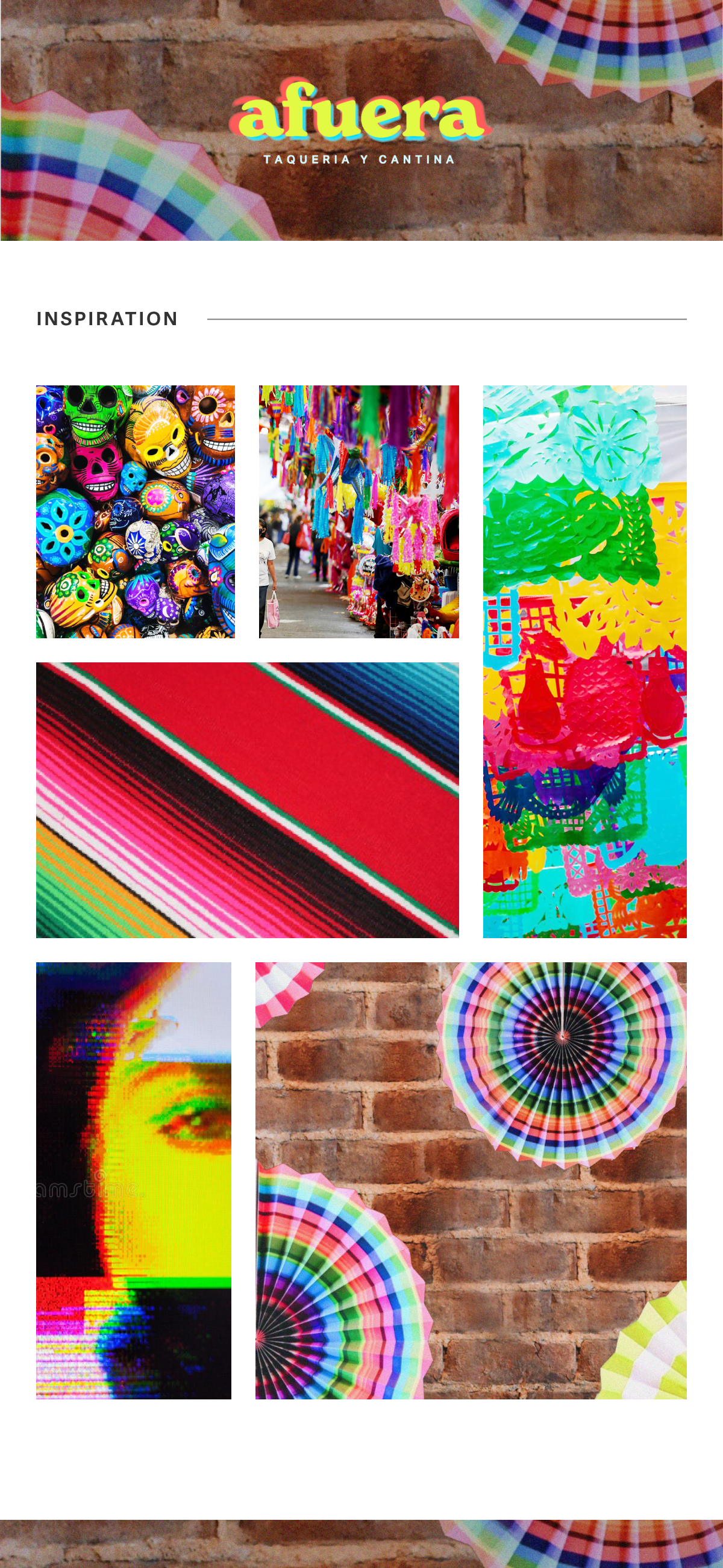
Before any user testing or thinking about interactions, my focus was on the logo and brand design. I used bright, poppy colors popular with millenials at the time and drawn from traditional Mexican crafts.
User Flow + Wireframes
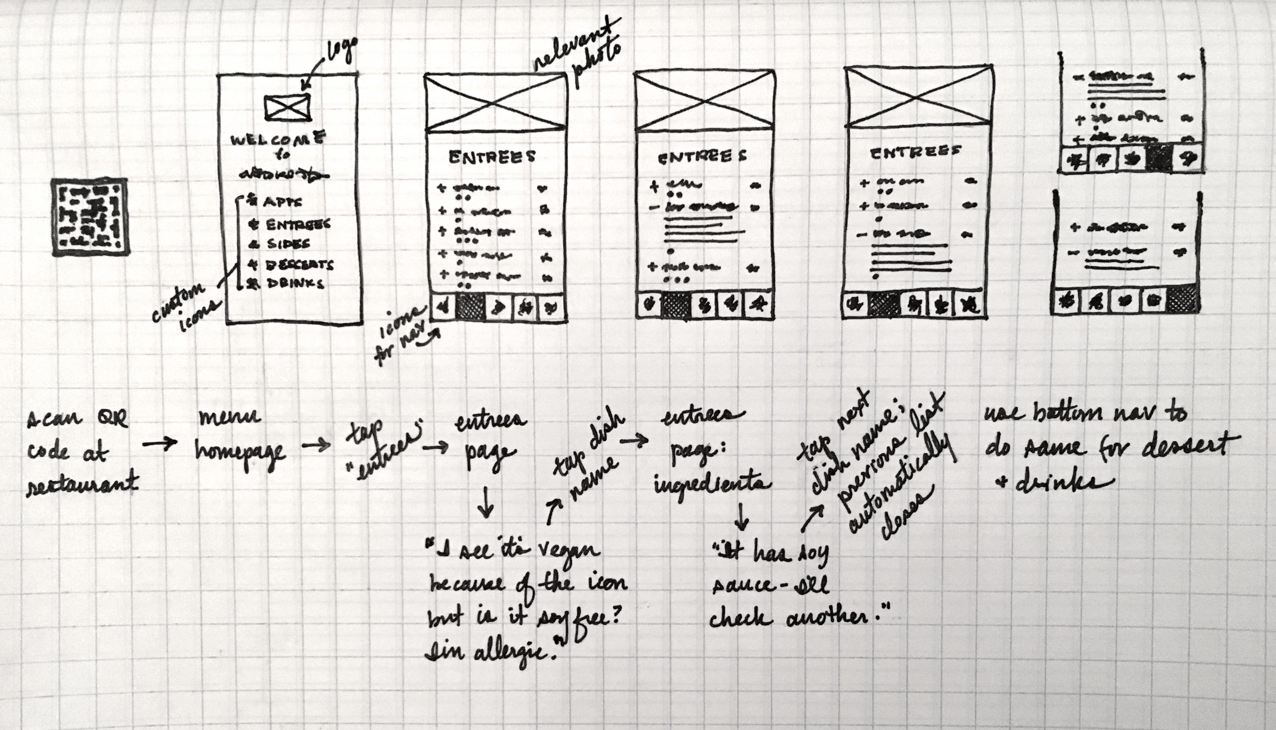
Early sketches helped establish the ordering flow and work through the main functionality.
Priorities included simple navigation, dietary filters, clear dish and allergen information, and an intuitive clear path from browsing to checkout.
KEY CONSIDERATIONS:
How should dietary filters behave as users move between menu categories?
How can the interface clearly and instantly confirm that an item was added to the order?
User Flow and Wireframes
Early sketches helped establish the ordering flow and work through the main functionality.
Priorities included simple navigation, dietary filters, clear dish information, and an clear path from browsing to checkout.
KEY CONSIDERATIONS:
How should dietary filters behave as users move between menu categories?
How can the interface clearly and instantly confirm that an item was added to the order?
Interaction Design
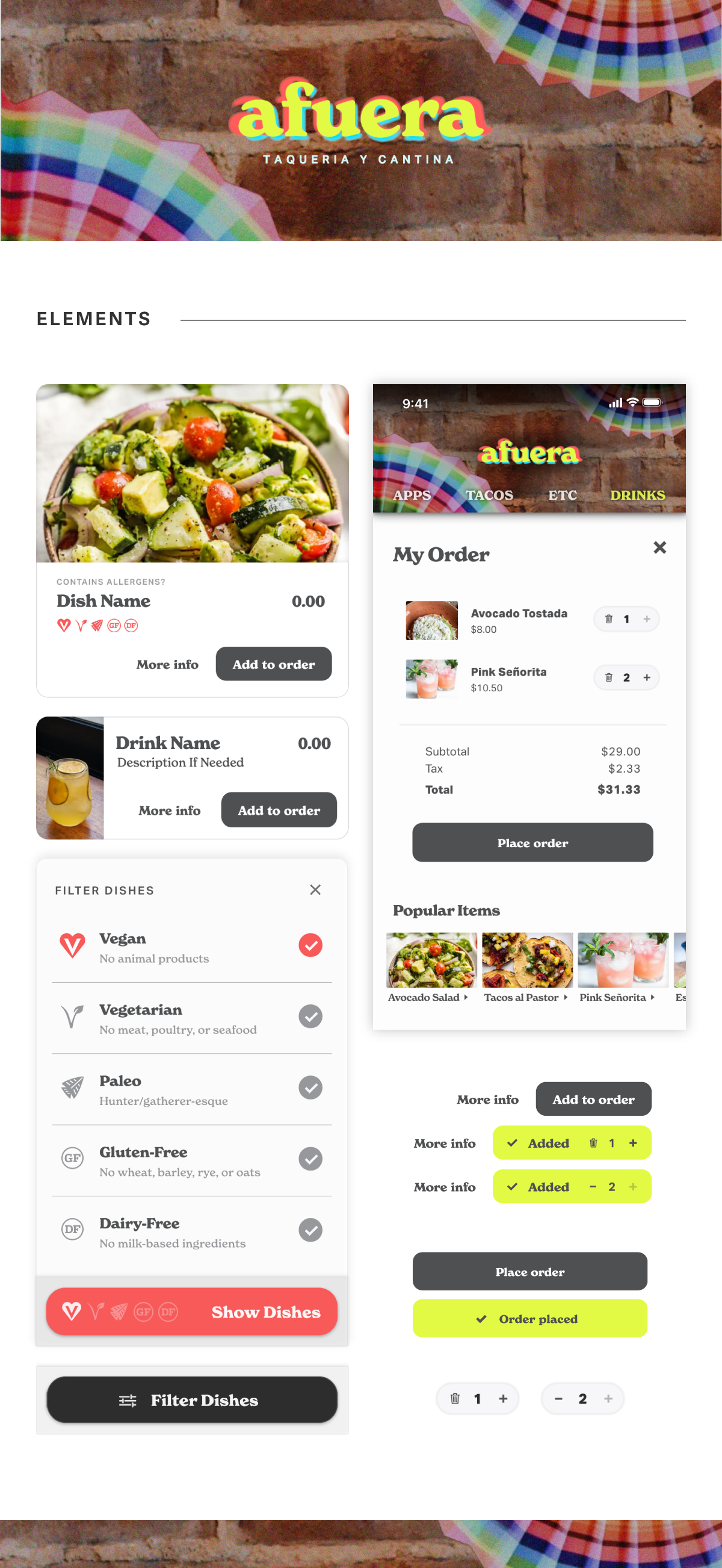
I really focused on building the interactive prototype to make the ordering experience feel as seamless as possible. Feedback and transitions were carefully designed to provide continuity as users move through the menu and build their order.
These interactions include:
persistent dietary filters
detailed dish views, listed allergens
immediate add-to-order feedback
live item counts, quantity controls, and updated order totals
Interactions: Dish Transitions
Individual dish views give users more information without losing their place in the menu.
Each includes a description, ingredient list, dietary and allergen information, with a direct option to add the dish to their order.
Setting up dish description transitions in Adobe XD
Interactions:
Dish Transitions
Individual dish views give users more information without losing their place in the menu.
Each includes a description, ingredient list, dietary and allergen information, with a direct option to add the dish to their order.
Setting up dish description transitions in Adobe XD
Interactions: Cart Additions
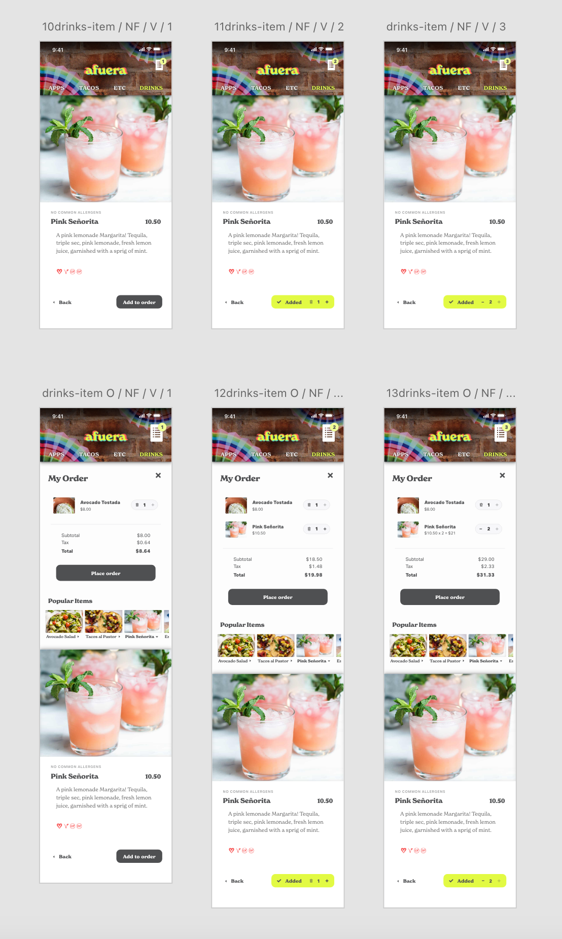
Adding or updating an item provides immediate visual feedback throughout the ordering experience.
Order counts, quantities, item states, and totals update as the order changes.
Building the cart's updates in Adobe XD
Interactions: Cart Additions
Adding or updating an item provides immediate visual feedback throughout the ordering experience.
Order counts, quantities, item states, and totals update as the order changes.
Building the cart's updates in Adobe XD
Artboard Linking
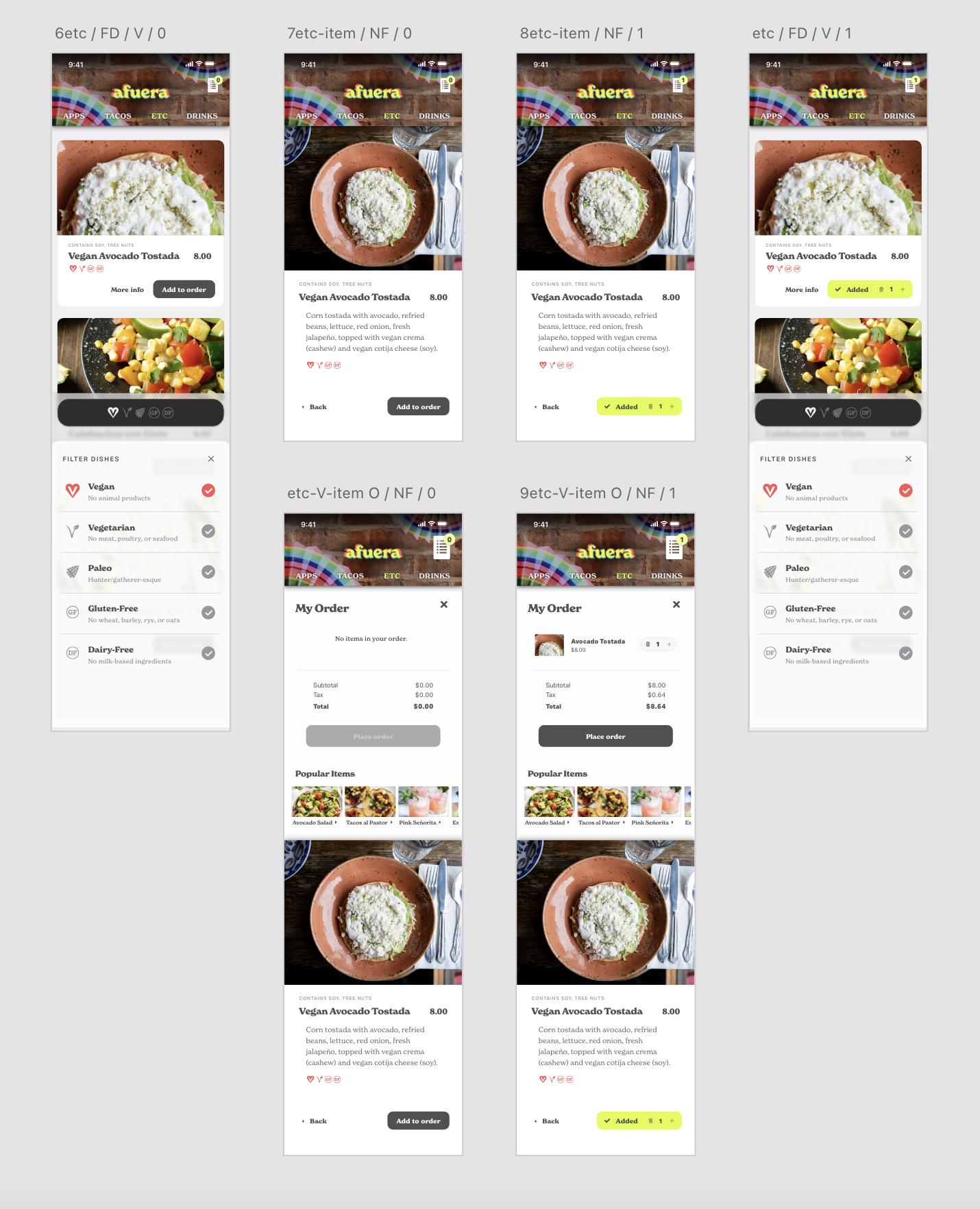
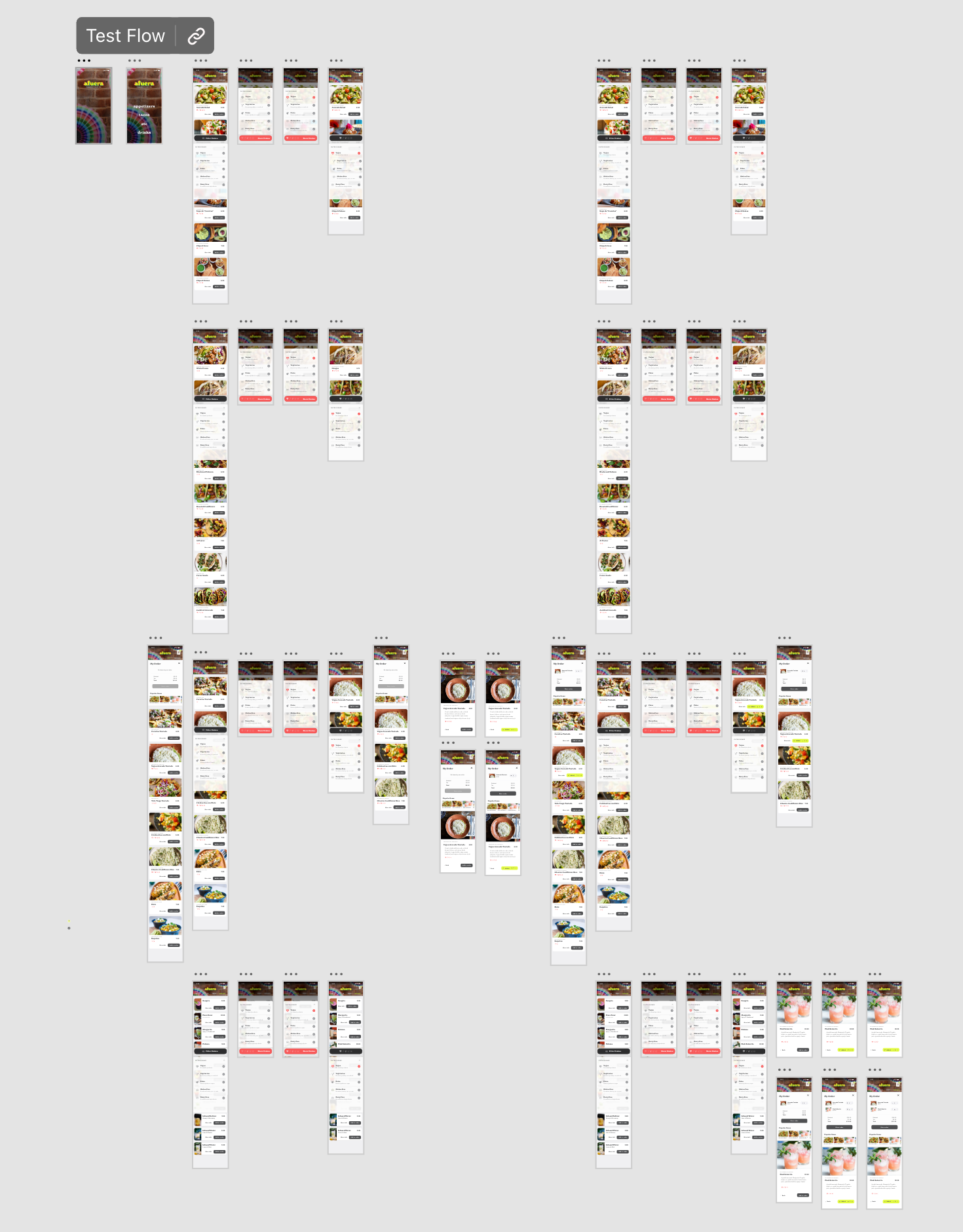
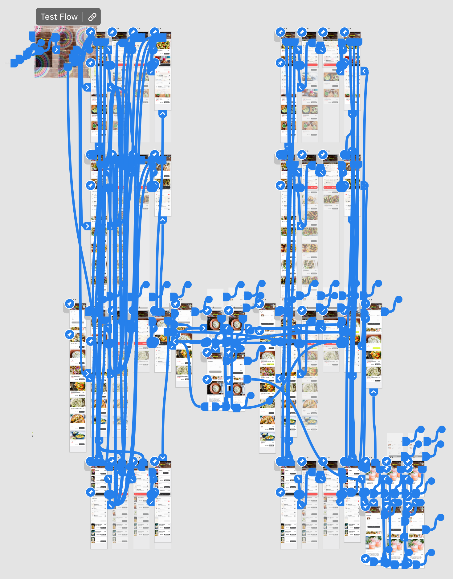
The screens on my pasteboard in XD are set up and named according to whether or not certain conditions are met and their position in the flow. What wasn’t automatically linked through the components I created I wired together by hand.
My pasteboard organization; screens are arranged by whether or not certain conditions are met
My screens all linked together, automatically through components and interactions, the rest by hand