
Web Updates: Tanzania Life Project
Specific updates to a hand-coded nonprofit website originally created 20 years ago. I edited raw HTML, CSS, PHP, JavaScript, and jQuery.
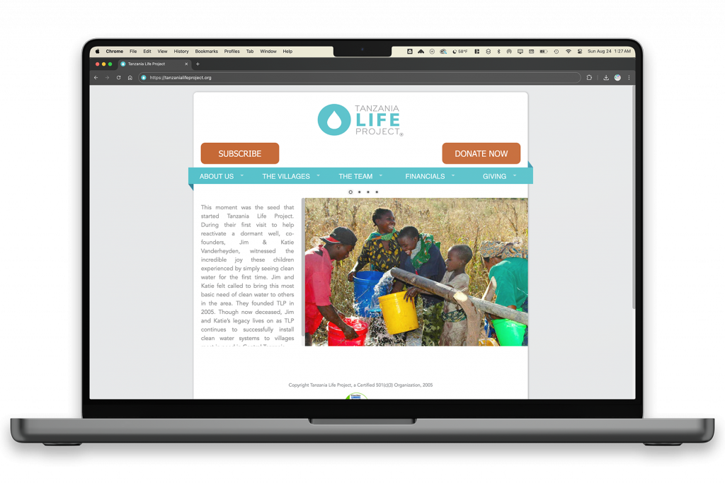
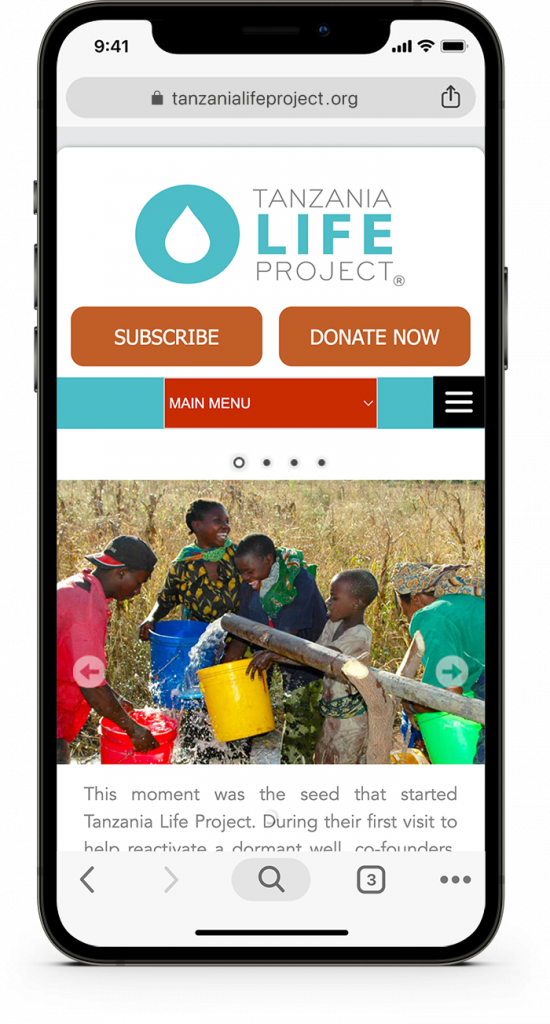
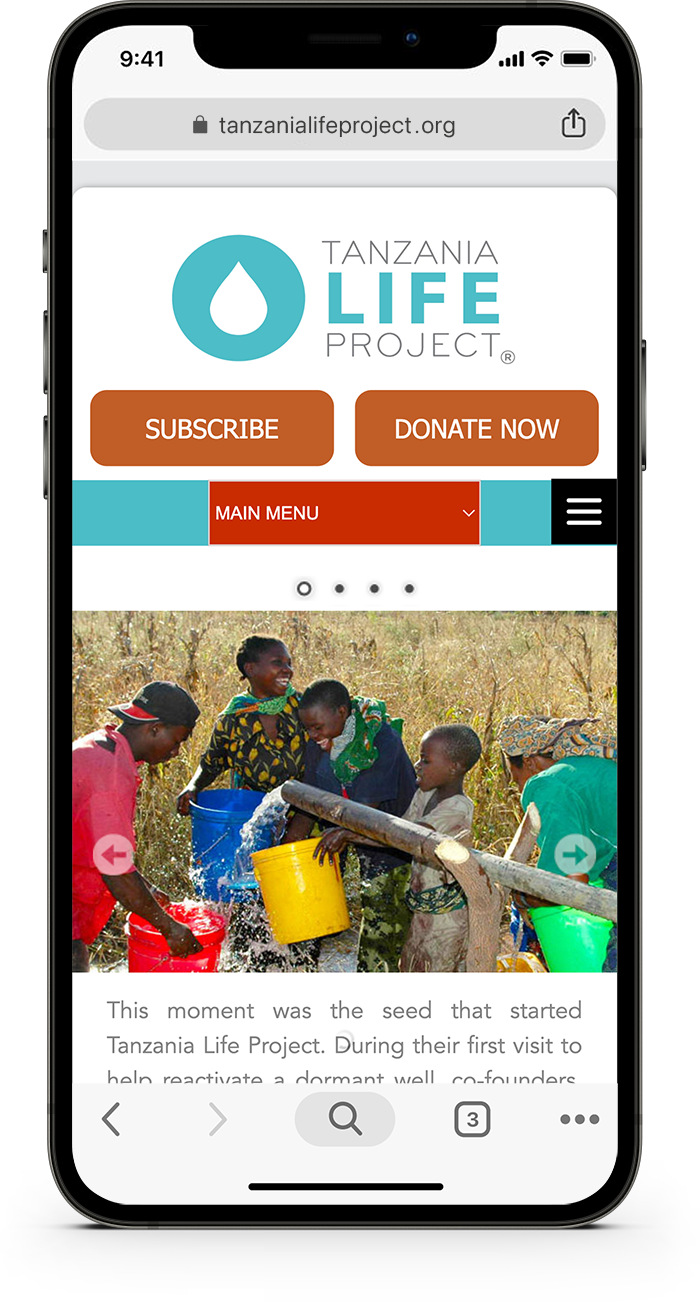
This project began with a few requested updates, but I quickly uncovered deeper structural issues. Outdated code, tangled file architecture, inconsistent fonts, and layout problems (all understandable given the site’s age and multiple contributors) made the site tricky to navigate, especially on mobile.
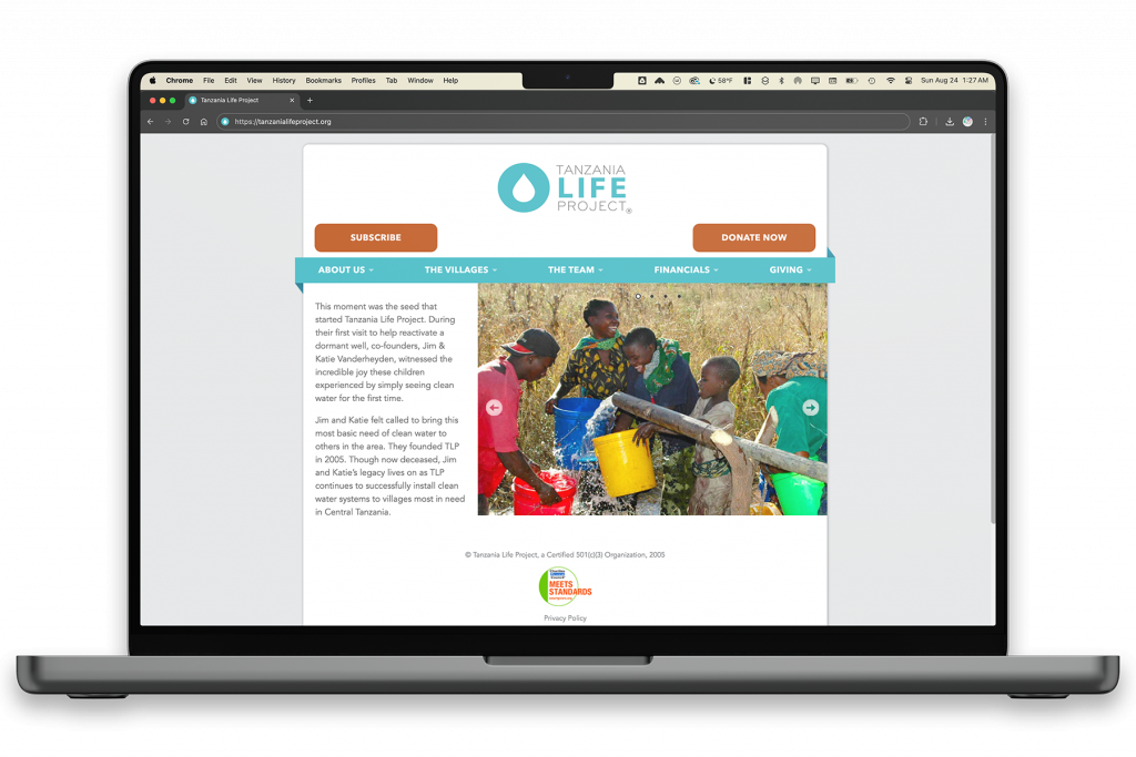
Beyond the original scope, I focused on visual consistency, mobile responsiveness, and clearer structure so the site felt more stable and easier to understand at a glance. Redesign is in the future; until then, this is informational, functional, and easier to navigate.
Specific updates to a hand-coded nonprofit website originally created 20 years ago. I edited raw HTML, CSS, PHP, JavaScript, and jQuery.
This project began with a few requested updates, but I quickly uncovered deeper structural issues. Outdated code, tangled file architecture, inconsistent fonts, and layout problems (all understandable given the site’s age and multiple contributors) made the site tricky to navigate, especially on mobile.
Beyond the original scope, I focused on visual consistency, mobile responsiveness, and clearer structure so the site felt more stable and easier to understand at a glance.
Redesign is in the future; until then, this is informational, functional, and easier to navigate..
June – August 2025
Tools
HTML, CSS, PHP, Javascript, jQuery
deliverables
- Updated website layout & design
- Improved mobile responsiveness
- Cleaned up HTML/CSS structure
keywords
responsive design, UX improvements, accessibility updates, user-friendly
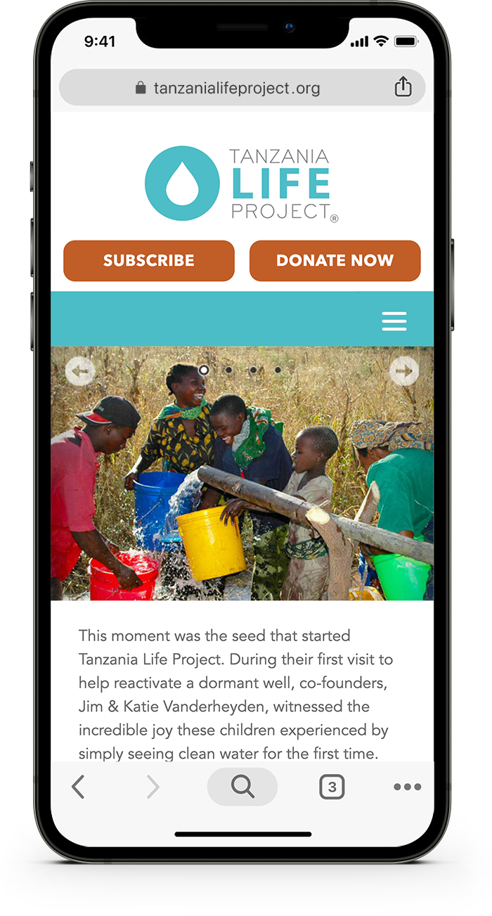
The original request was simple: update a few text sections across multiple pages and add a “Subscribe” button in the header, styled to match the existing “Donate Now” button.
But once I got into the site’s files, it became clear there were deeper issues worth addressing – especially around mobile responsiveness, code maintainability, and overall polish.
Untangling the Code
The site had grown organically over time, with multiple contributors and years of incremental changes. Once I really dug into the code, I found:
- Redundant or clashing CSS rules across multiple stylesheets
- Z-index conflicts and overlapping positioning hacks
- Font files that didn’t render due to naming mismatches
- Fixed-width containers that broke on small screens
- Scattered backups, duplicate pages, and unused scripts
These made even small updates risky, so I began cleaning things up behind the scenes while working on the original requests.
Why Mobile First?
Most of Tanzania’s web traffic (over 80%) comes from mobile devices. Globally, that trend holds true as well. On top of that, mobile internet is faster than wired in many regions of Tanzania. These insights come from the 2025 DataReportal digital trends report (see below), which helped shape my approach.
Designing for mobile is essential for accessibility and usability. With that in mind, I made sure every design and layout choice worked well for mobile users first.
Improving the Mobile Experience
Once I confirmed that mobile had to take the lead, I set specific goals:
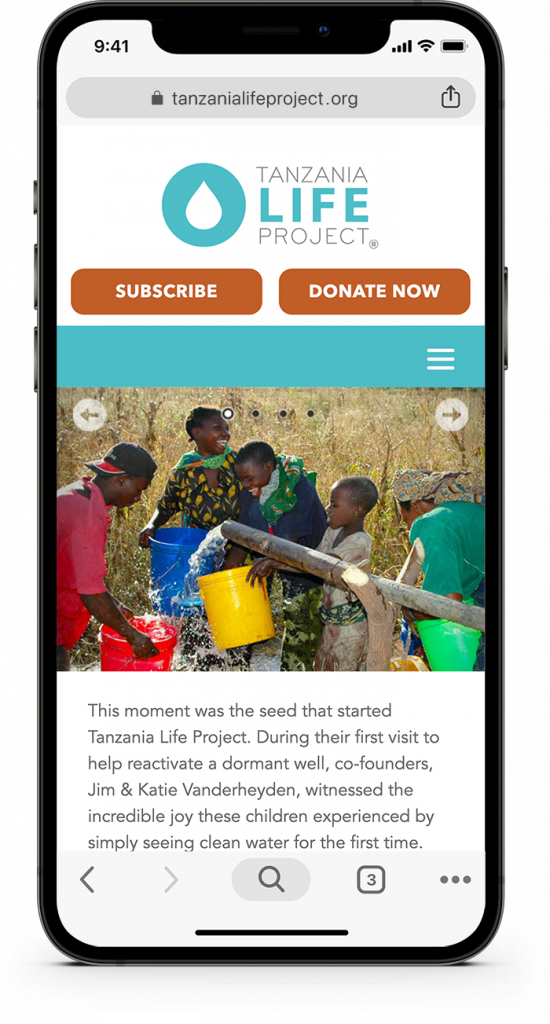
- Make layouts flexible and legible across screen sizes
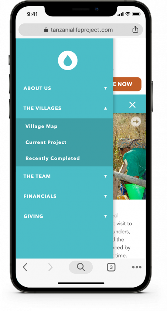
- Fix broken navigation behaviors
- Ensure key actions like “Donate,” “Subscribe,” and “Contact” are clearly visible and opened in new tabs
- Resolve font issues so Avenir loads consistently
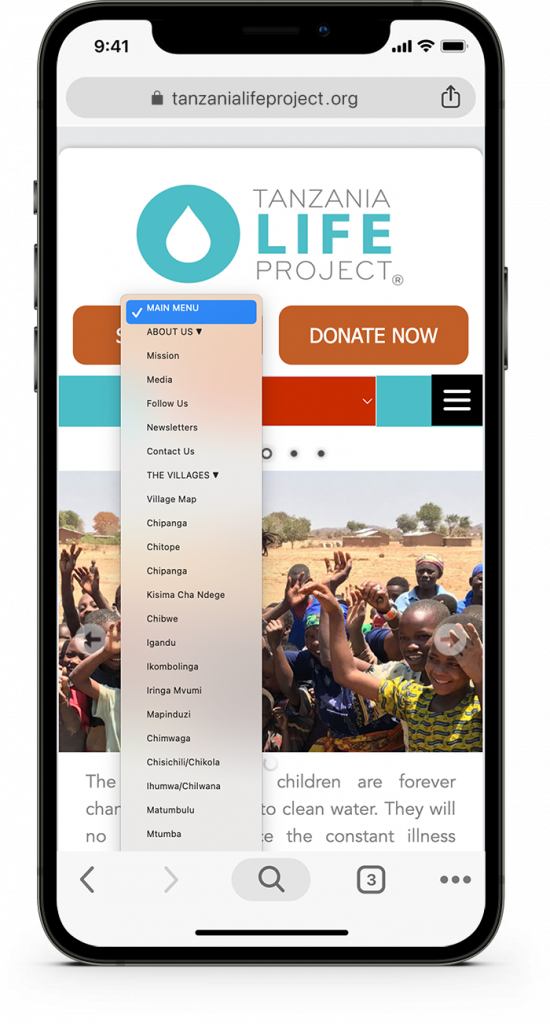
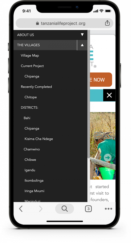
- Rebuild the mobile nav so it works smoothly across devices (see below)


Visual and Functional Cleanup
Beyond fixing layout and code issues, I polished some visual elements too:
- Repaired broken font calls for a cleaner, more cohesive and trustworthy look
- Standardized button styling, CTAs feel more intentional
- Applied flexbox layouts for smoother responsiveness
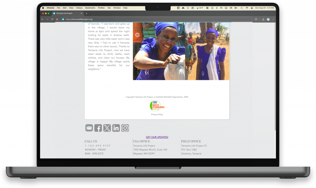
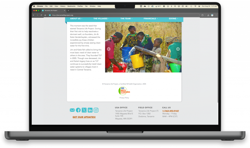
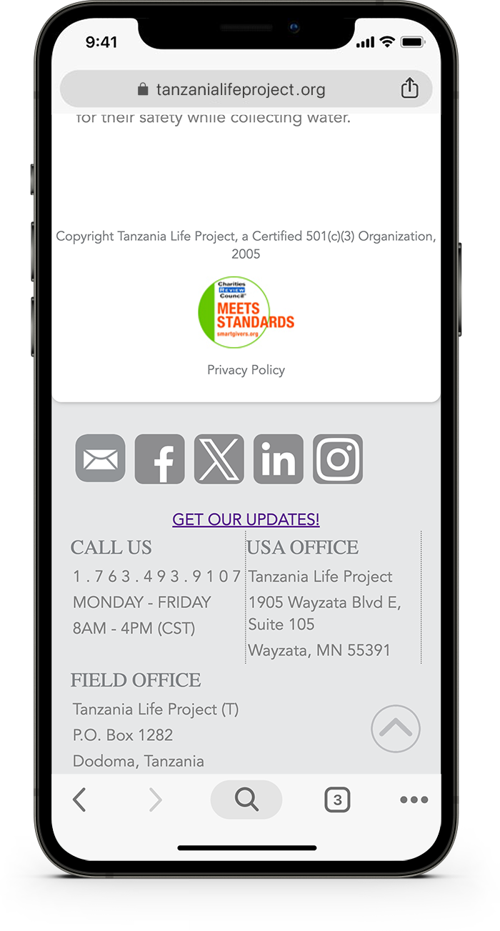
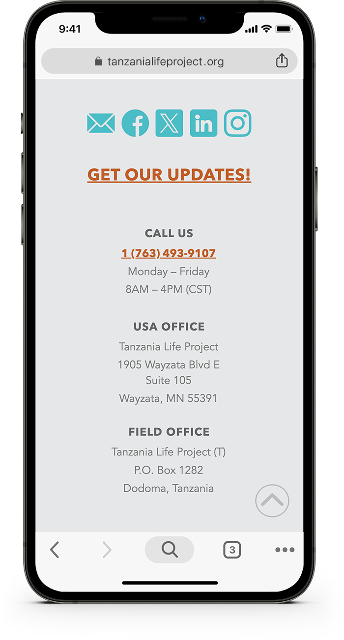
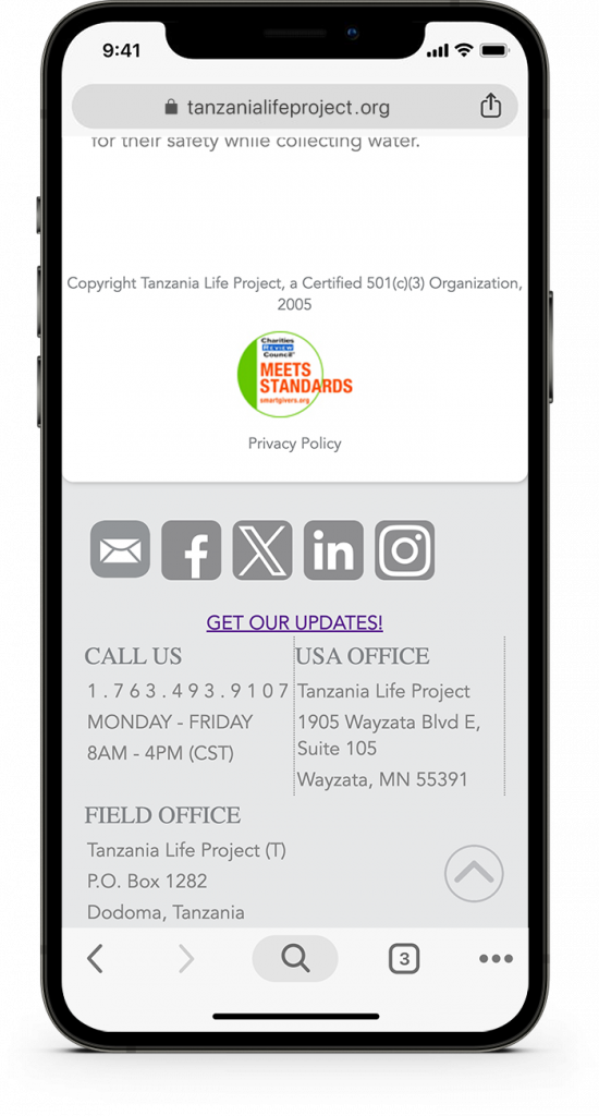
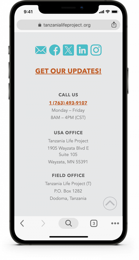
- Redesigned the footer for clarity and consistency (see below)
Final Thoughts
The project started with small updates but evolved into a deeper cleanup effort. Now the site is easier to maintain, performs better on mobile, and presents a more polished experience to visitors, especially those accessing it from Tanzania, where mobile usage dominates.
The structure is cleaner and more scalable, giving the organization a smoother path toward a full redesign in the future.

