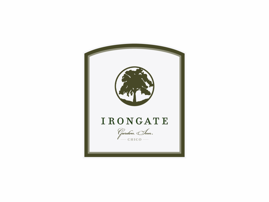
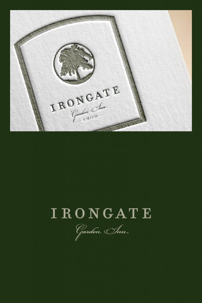
With a focus on personalization, I created the frame in the exact shape of the iron gate at the venue and used the tree image that’s actually part of the gate itself. Plenty of whitespace maintained a clean and minimal look.
With a focus on personalization, I created the frame in the exact shape of the iron gate at the venue and used the tree image that’s actually part of the gate itself. Plenty of whitespace maintained a clean and minimal look.
Client:
Sidenote
Industry & Location:
Blogger in St. Paul, Minnesota
Keywords:
clever, clean, complex but orderly
Solution:
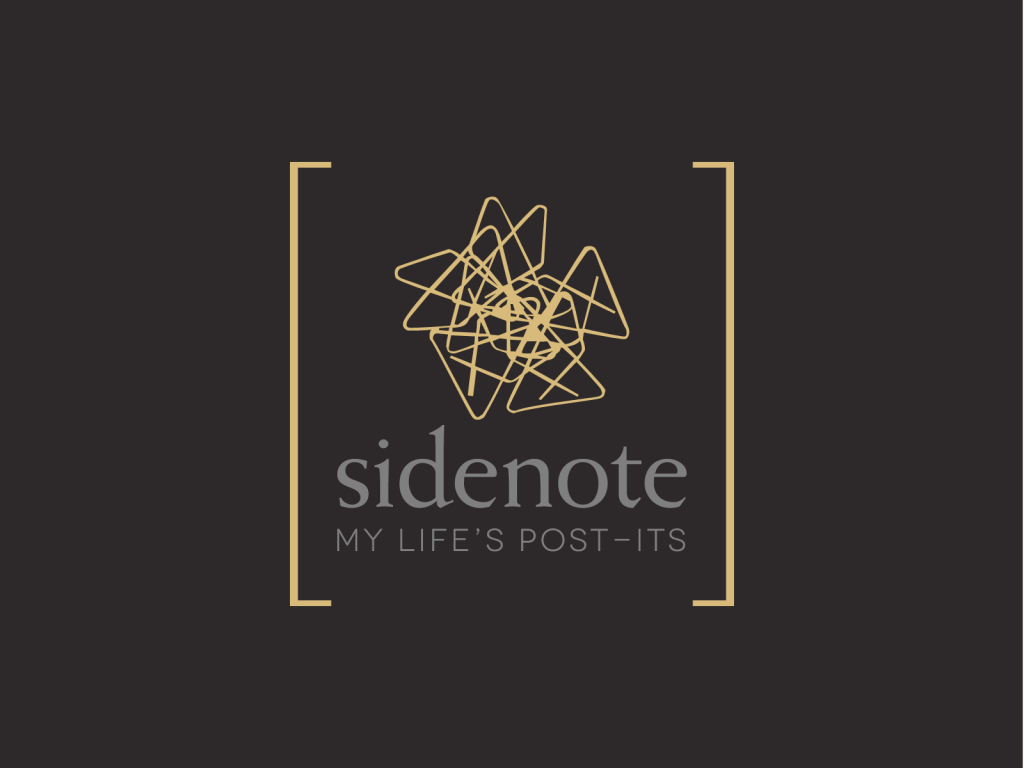
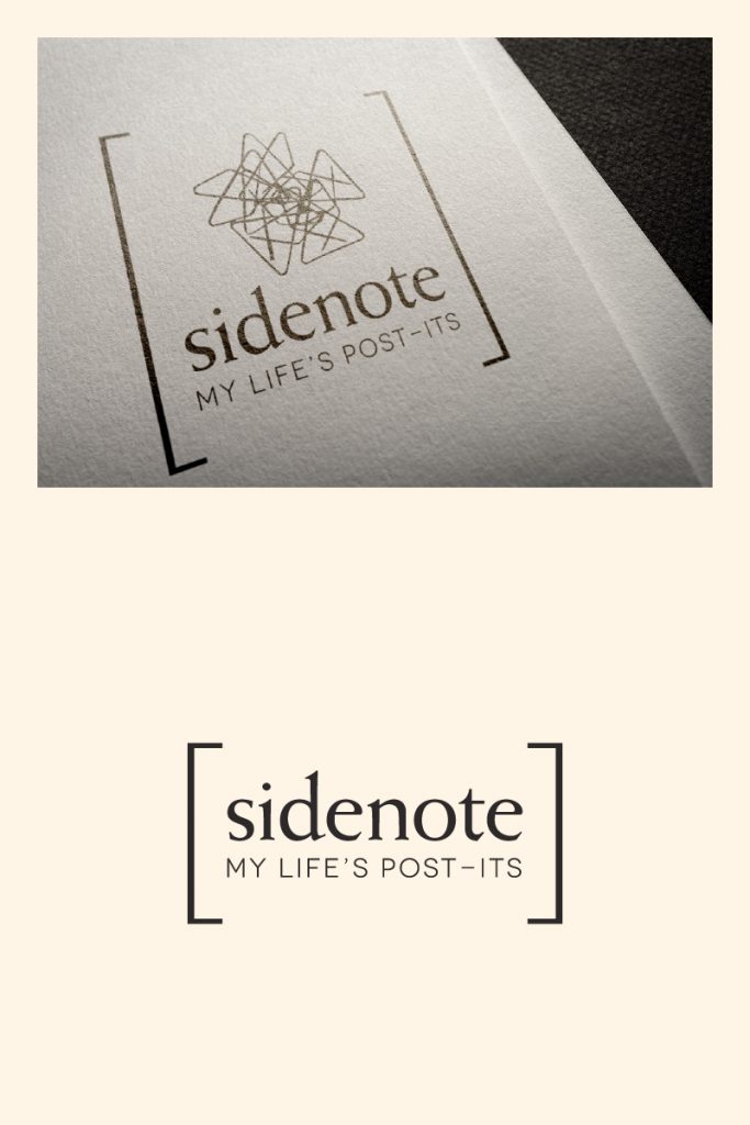
The brackets are inspired by the look of a post-it note as well as a comment that might appear in a sidebar; the mark resembles both crumpled paper and a pile of butterfly-type paperclips. All of these things are probably found on the blogger’s desk.
The brackets also serve as a container for the somewhat chaotic visual.
Client:
Sidenote
Industry & Location:
Blogger in St. Paul, MN
Keywords:
clever, clean, complex, layered, orderly
Solution:
The brackets are inspired by the look of a post-it note as well as a comment that might appear in a sidebar; the mark resembles both crumpled paper and a pile of butterfly-type paperclips. All of these things are probably found on the blogger’s desk.
The brackets also serve as a container for the somewhat chaotic visual.
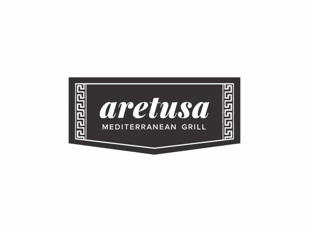
The fonts are clean and the lines are thick enough to be clearly read when scaled down. The Greek key pattern can be used as a branding element in other applications.
Website link and full web design/development case study on project details page.
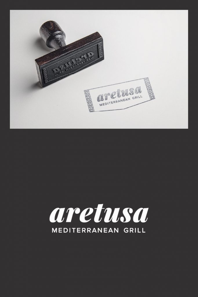
The fonts are clean and the lines are thick enough to be clearly read when scaled down. The Greek key pattern can be used as a branding element in other applications.
Website link and full web design/development case study on project details page.
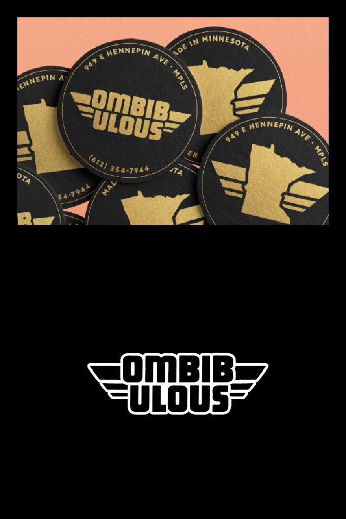
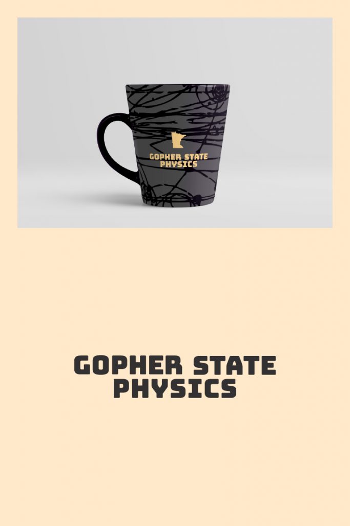
My font choice imparted a friendly tone and was easily read at smaller sizes. The particle paths through the silhouette of Minnesota provided a visual clue to the content as well as an interesting pattern to be used throughout the logo’s applications.
Client:
Gopher State Physics
Industry, Location:
Physics Teachers’ Network in MN
Keywords:
bold, physics imagery, clear, friendly, youthful
Solution:
My font choice imparted a friendly tone and was easily read at smaller sizes. The particle paths through the silhouette of Minnesota provided a visual clue to the content as well as an interesting pattern to be used throughout the logo’s applications.
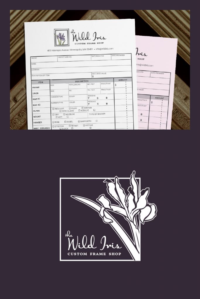
My main goal was to create a logo with depth, since framing is such a 3-dimensional craft. I applied a watercolor effect to the primary logo and had the iris images coming out of their frames.
Website link and brief case study on project details page.
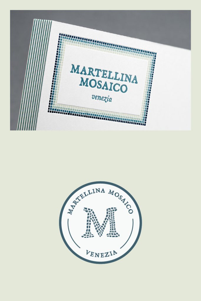
Logo with variations for a mosaic artist based in Venice, Italy. The typeface was chosen to convey a historical letterpress look that reflects the time-honored roots of mosaic art in northern Italy; the colors were chosen directly from an aerial photo of the Venetian lagoon.
My main goal was to give the image some depth, since framing is such a 3-dimensional craft. I applied a watercolor effect to the primary logo and had the irises of both the primary and secondary logos coming out of their frames.
Website link and brief description on project details page.
Logo with variations for a mosaic artist based in Venice, Italy. The typeface was chosen to convey a historical letterpress look that reflects the time-honored roots of mosaic art in northern Italy; the colors were chosen directly from an aerial photo of the Venetian lagoon.
simple, literal, black & white, repetition, clear, mirrored
Solution:
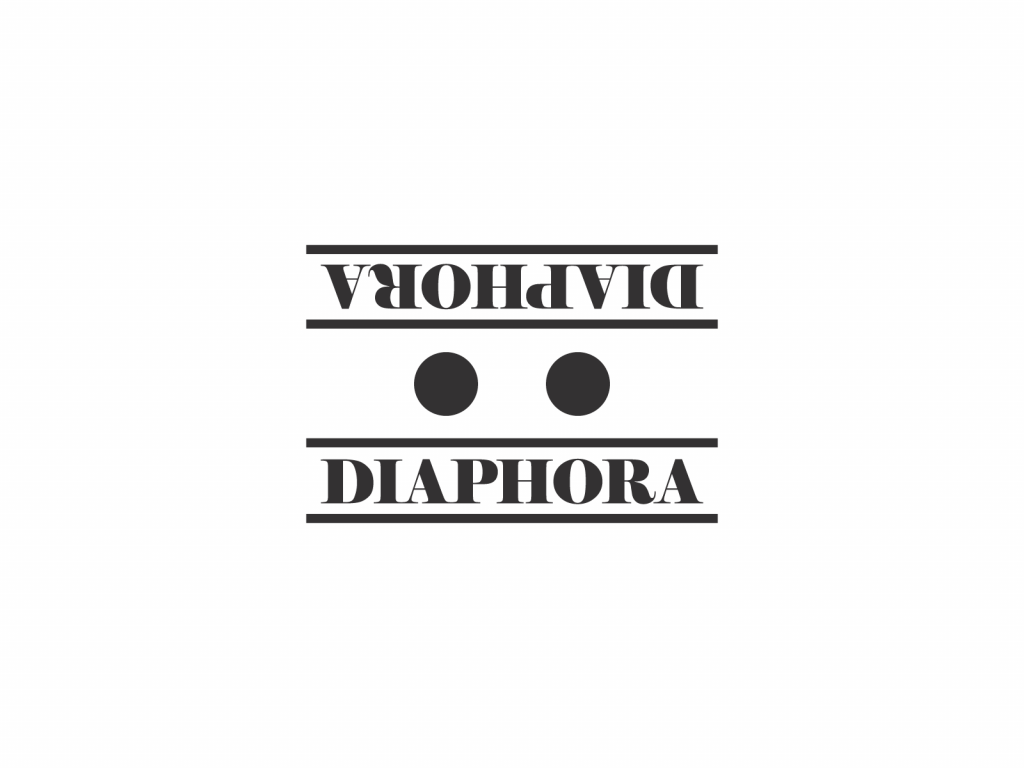
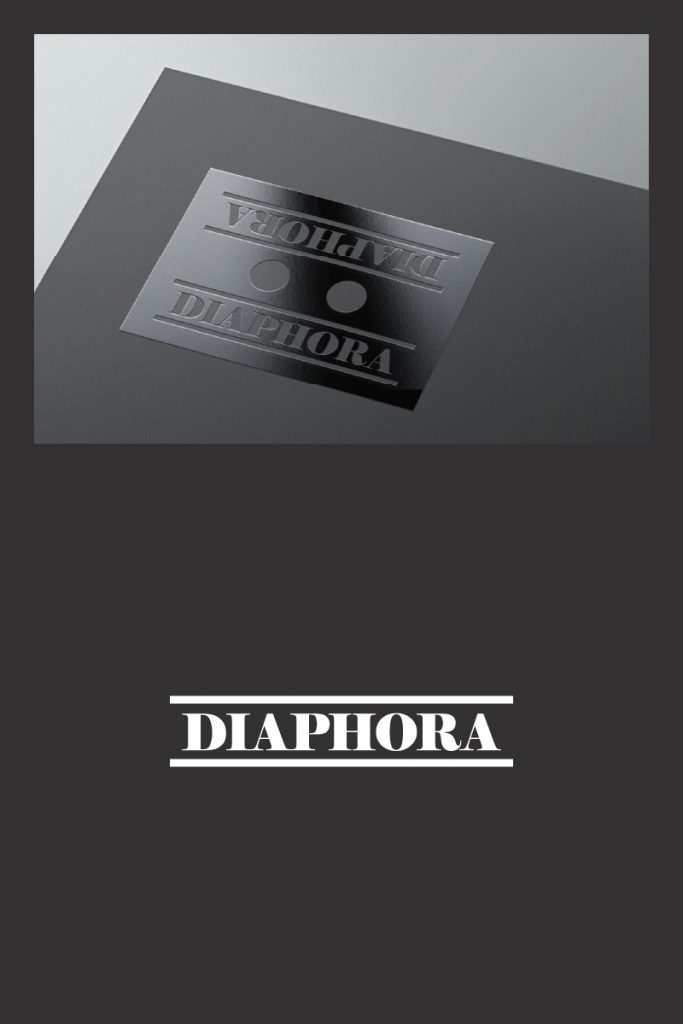
The word ‘diaphora’ has to do with repetition and double meanings. This idea was conveyed through the mirrored text as well as the occurrences of doubles: circles, lines, and halves of the image.
Client:
Diaphora
Industry, Location:
Media group in Minneapolis, MN
Keywords:
simple, literal, black & white, repetition, clear, mirrored
Solution:
The word ‘diaphora’ has to do with repetition and double meanings. This idea was conveyed through the mirrored text as well as the occurrences of doubles: circles, lines, and halves of the image.